Vicious Circles · Repeat Until It Cuts
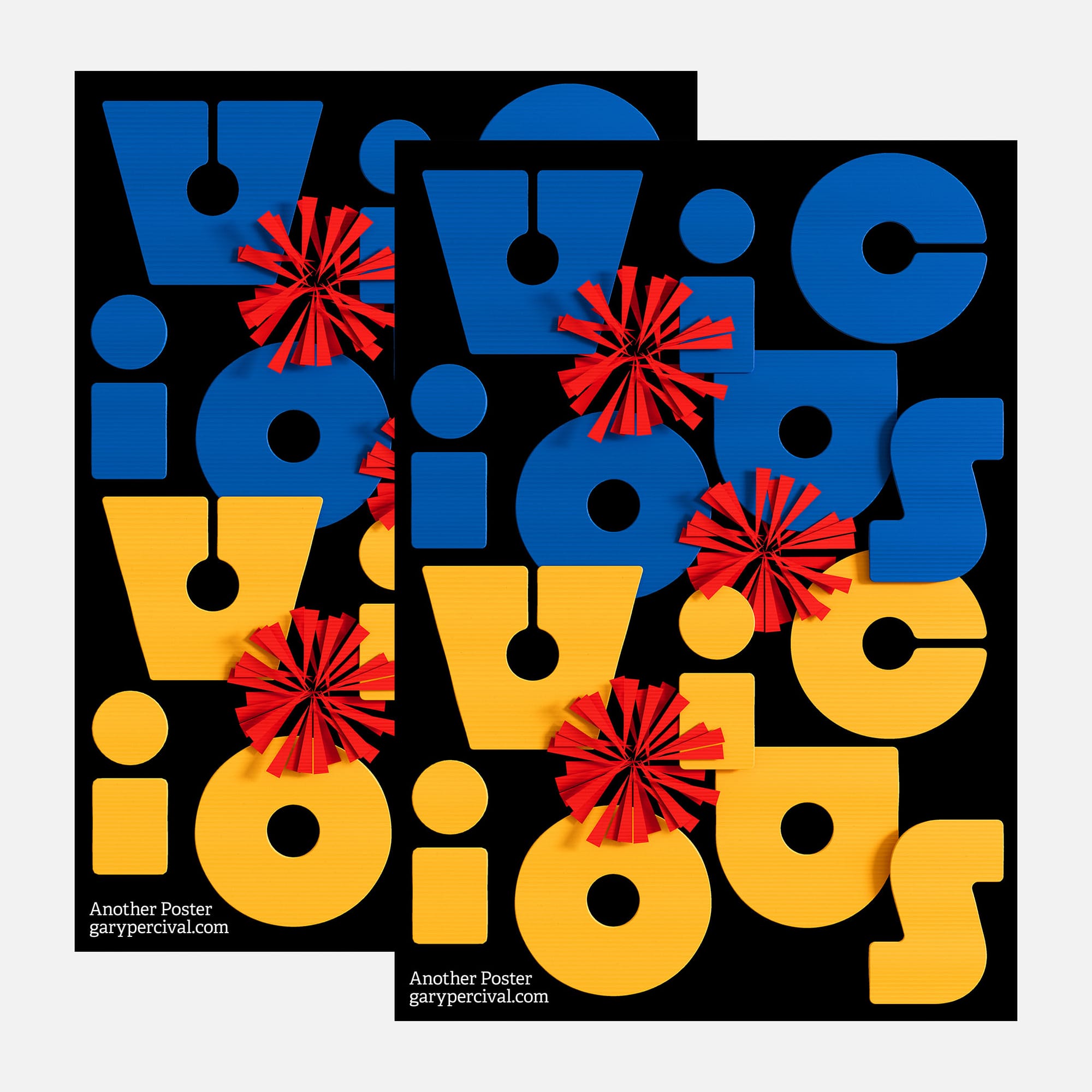
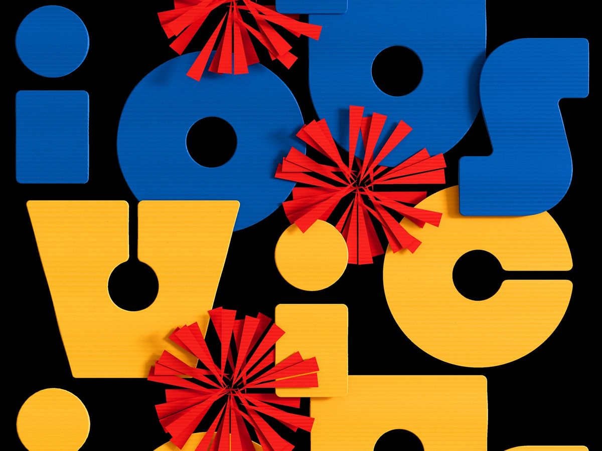
A word set twice. Same shapes. Different colour. Red spiked discs cut through the rhythm.
Why this week's poster
The phrase came first. Vicious circles. A loop that hurts to stay inside.
I wanted the type to enact it.
Same word, twice.
Same shapes, different colour.
Red discs breaking through where the pattern begins to fail.
The Build
- Objects. Spiked paper discs. Modelled as segmented fans, each blade cut from a single sheet then rotated around a centre point. Three interruptions across the composition.
- Letters. Heavy geometric forms. Wide apertures, generous counters, deliberately simple so the discs read cleanly against them.
- Colour. Cobalt blue over yellow, both on flat black. Red for the discs 〰 the only warm note, kept saturated so it cuts.
- Lighting. Flat soft key. Minimal falloff. The discs carry a slight raised shadow to lift them off the type.
- Texture. Fine corrugation running horizontally through the letterforms. The discs stay smooth 〰 sharp against the ridged type.
- Type. Custom drawn. No tracking work needed 〰 the letters butt against each other and hold the grid.
What worked
- The repetition sells the concept without a caption.
- Red against blue and yellow gives two different tensions from the same disc.
- The corrugation on the type reads as effort. The discs read as interruption.
What I'd push next time
- A third repeat in a muted tone to see where repetition stops adding tension and starts becoming wallpaper.
- Smaller disc variants scattered at the edges.
- A version where the discs sit behind the type instead of over it.
Print Details
- Edition: open weekly release
- Sizes: A3
Close
The word repeats because the form repeats.
Break the pattern once and the whole composition changes.