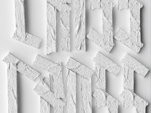
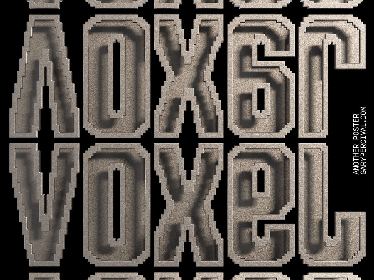
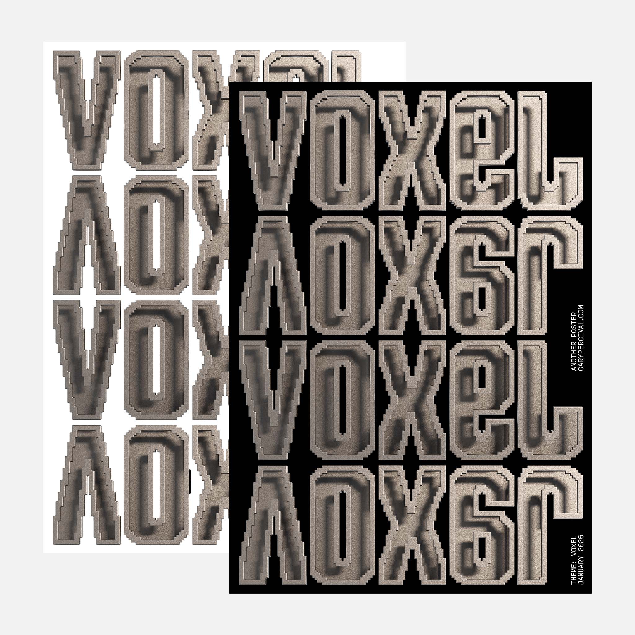
Voxel · Structure Holds
A typographic poster built from stepped units. Repeated. Aligned. Constrained. An experiment in structure, accumulation, and restraint.
Why this week’s poster
I wanted to slow things down.
Voxel work forces restraint.
No curves to hide behind.
No smooth gradients to soften decisions.
Everything resolves in steps.
That limitation became the point.
Voxel is about structure holding under repetition.
The same word.
The same form.
Repeated without novelty carrying the weight.
If something works, it should survive being shown again.
The build
- Form. Each letter constructed from stepped geometry. No smoothing. Edges stay deliberate.
- System. A strict grid. Repetition does the talking. Variation stays minimal.
- Material. Metal-like surface with subtle noise. Enough texture to break perfection without adding drama.
- Lighting. Single dominant key with controlled falloff. Shadows stay inside the forms. Depth comes from structure, not contrast.
- Palette. Neutral. Muted. The goal was weight, not energy.
- Composition. Tight spacing. No breathing room. The block reads as one object, not separate words.
What worked
- The stepped edges give the type physical authority.
- Repetition reveals flaws quickly. That pressure improves decisions.
- The material stays quiet enough to let structure lead.
What I’d push next time
- A version with even harsher lighting to exaggerate depth loss.
- A motion test where the letters resolve from low to high resolution.
- Exploring negative space cuts inside the forms without softening the system.
Print details
- Edition: open weekly release
- Sizes: A3
Close
Voxel work removes excuses.
No gesture.
No flourish.
Just form, repeated until it either holds or fails.
This one held.
🛍️ Like this style? Explore Posters → / Follow on Instagram →