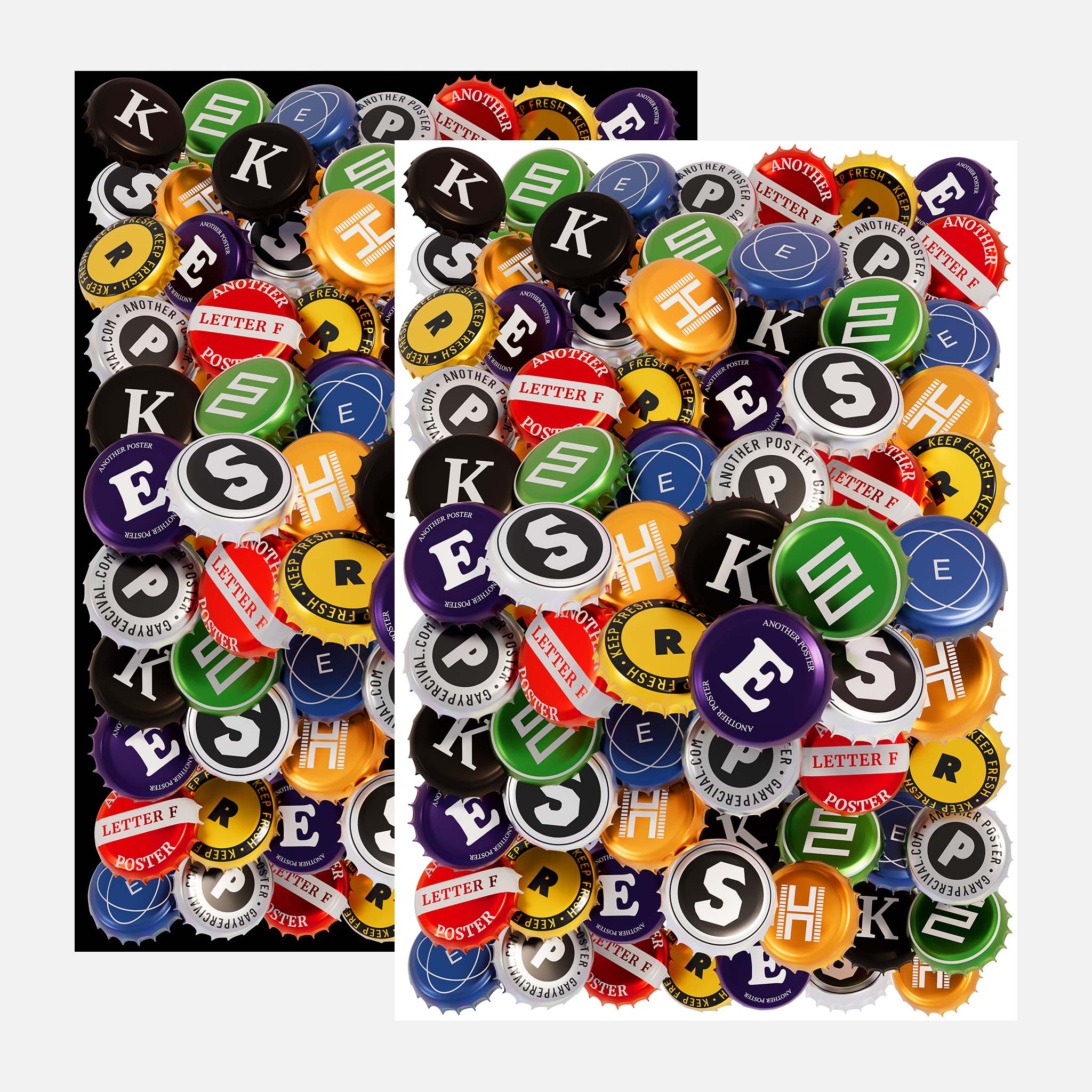
Keep Fresh
A poster built from bottle caps collected, sorted, and recomposed into type. Disposable objects. Reusable meaning. A reminder that freshness is something you maintain, not something you chase.
Why this week’s poster
Freshness usually gets framed as novelty.
New ideas.
New tools.
New directions.
That version doesn’t last.
I wanted to look at freshness as upkeep.
As discipline.
As attention.
Bottle caps felt right.
Objects designed to seal something in.
To preserve.
To stop things going flat.
Keep Fresh reads like packaging language.
It also reads like advice.
Freshness isn’t accidental.
It’s maintained.
The build
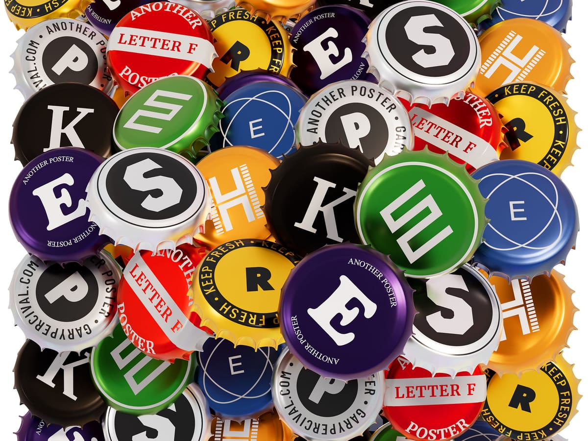
- Objects. Standard crown bottle caps. Mixed colours. Mixed sources. All familiar.
- Letters. Built entirely from repetition. Caps stacked, rotated, and packed until the forms held.
- Colour. Dense. No breathing room. The pressure keeps the energy alive.
- Lighting. Clean top light for legibility •• soft fill to keep edges readable •• minimal shadow to avoid depth tricks.
- Surface. Gloss retained. Minor wear left in. These aren’t pristine objects.
What worked
- The density sells freshness as effort, not ease.
- Familiar packaging language makes the message land fast.
- Colour variation keeps the surface alive without decoration.
It reads instantly.
Then you notice how much work sits underneath.
What I’d push next time
- A version with controlled colour bands rather than full mix.
- Slight height variation across caps for more micro-rhythm.
- A motion test where the letters collapse and get rebuilt.
Print details
- Edition: open
- Sizes: A3
Close
Freshness fades when you stop paying attention.
Not because time passes.
Because maintenance stops.
This poster is a reminder to keep sealing the work.
Keep editing.
Keep choosing.