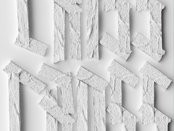
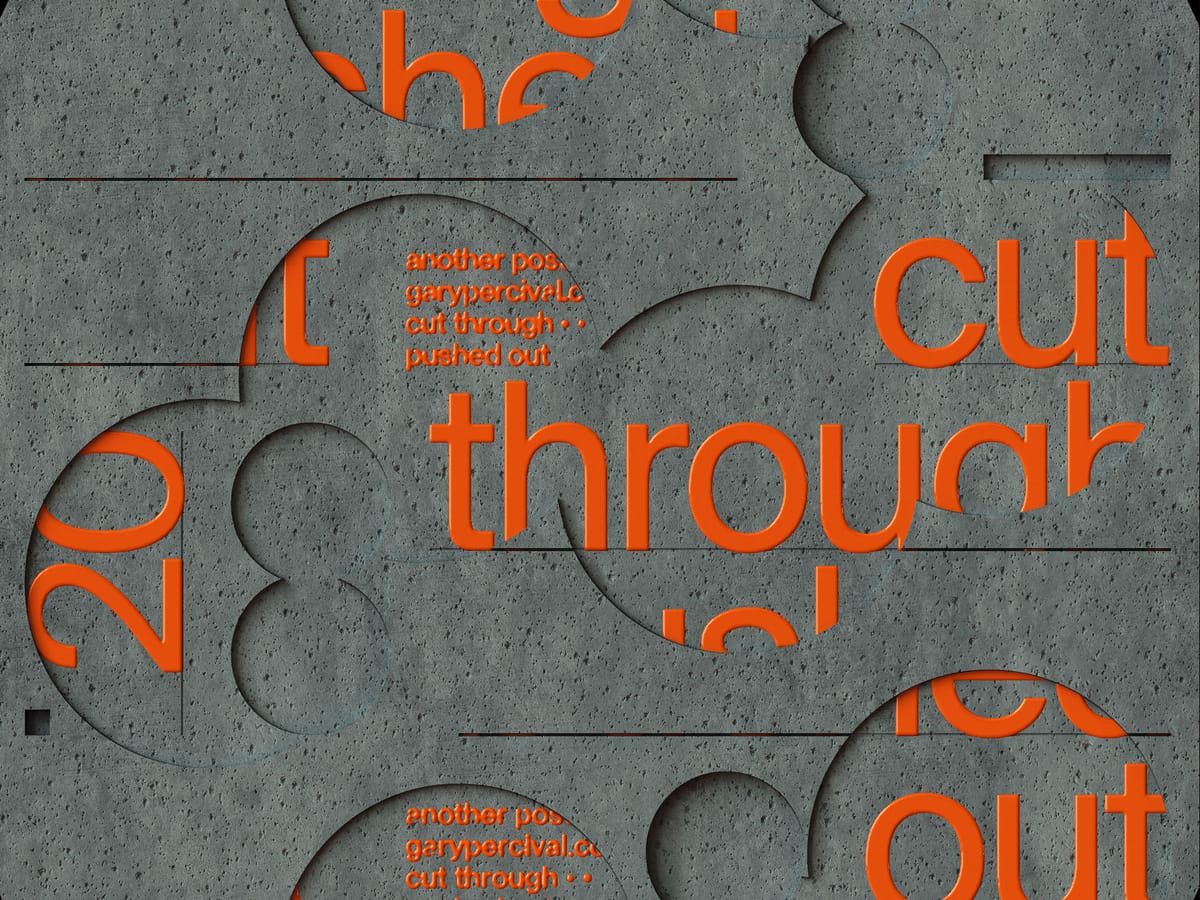
Cut Through ·· Pushed Out
A typographic poster built around subtraction and pressure. Forms carved away. Shapes displaced. Meaning revealed by what’s removed.
Why this week’s poster
This one started with resistance.
I wasn’t interested in adding more.
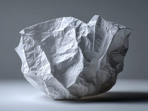
I wanted to see what happened when I took material away.
Cutting creates clarity.
Pressure creates movement.
The phrase followed naturally:
Cut through ·· pushed out
It describes the form.
It also describes the feeling of progress when friction does the shaping.
The build
- Structure. A solid base shape treated as a single mass. Nothing decorative added.
- Subtraction. Circular and curved cuts carved directly through the form. No soft edges.
- Displacement. Elements feel pushed from behind rather than placed on top.
- Typography. Large, blunt type set beneath the surface. Revealed only where material gives way.
- Colour. High-contrast pairings to separate surface from depth. The text needed to feel physical, not graphic.
- Finish. Hard lighting to emphasise edges and depth shifts. Shadows do the explaining.
What worked
- The cuts read immediately. No explanation needed.
- The layered depth holds at distance and close up.
- The typography feels discovered, not applied.
What I’d push next time
- More variation in cut depth across the surface.
- A second pass on edge wear where pressure feels highest.
- A motion test where the text emerges gradually through the form.
Print details
- Edition: Open weekly release
- Sizes: A3
Close
Sometimes progress doesn’t come from adding effort.
It comes from pressure applied in the right place.
This poster records that moment.