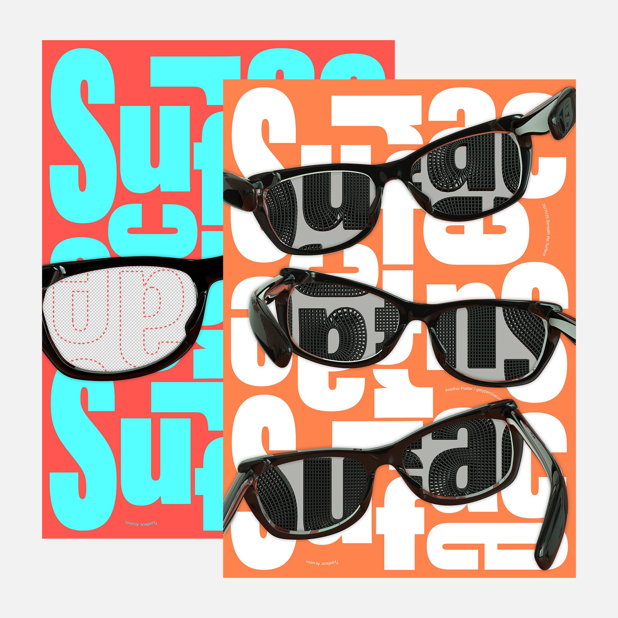
Beneath the Surface · Look Closer
Three frames · one message. What you focus on shapes what you see. Your work, your week, your progress · it all shifts when you look past the surface.
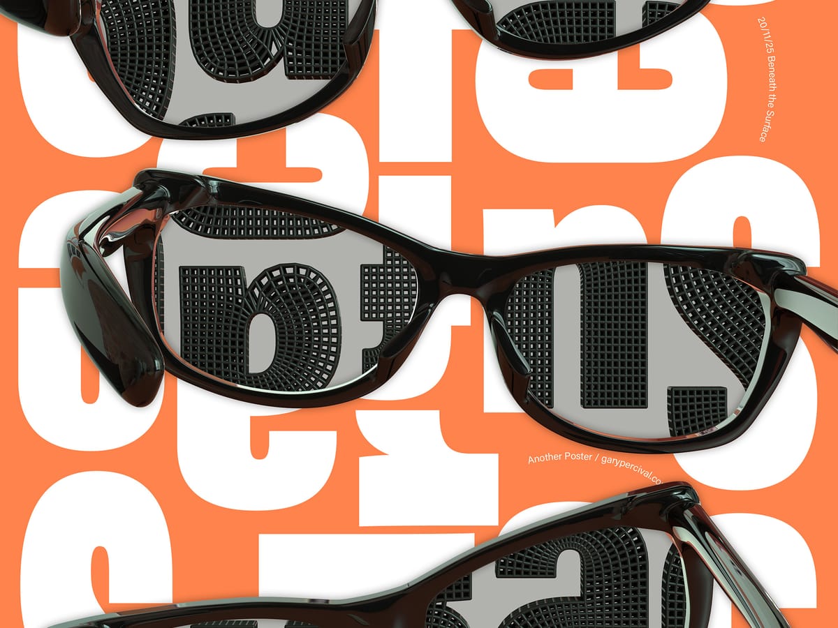
Why this week’s poster
A focus on perception, layering, and what hides in plain sight.
The build
- Objects. Simple wraparound glasses. Modelled with clean edges and slight asymmetry.
- Letters. Heavy shapes set tight. The dotted outlines add a second layer once you look through the lenses.
- Colour. Strong backgrounds with sharp pairings. Each palette gives a different read.
- Lighting. Soft key 〰️ gentle side fill 〰️ controlled specular on the frames.
- Texture. Subtle wear on the plastic. Smooth lenses to keep reflections readable.
- Type. Oversized word forms set behind everything. The glasses break the repetition.
What worked
- The reflections pull your eye into the frame.
- The lenses isolate the word and change the tone.
- The bold type carries the layout; no extra elements needed.
What I’d push next time
- Extra curvature in the lens shading for more depth.
- A stronger grid alignment for the background.
- A motion test where the word appears only when you tilt the frame.
Print details
- Edition: open
- Sizes: A3
Close
A small reminder to look longer than you think you need to. The interesting parts usually sit beneath the obvious layer.