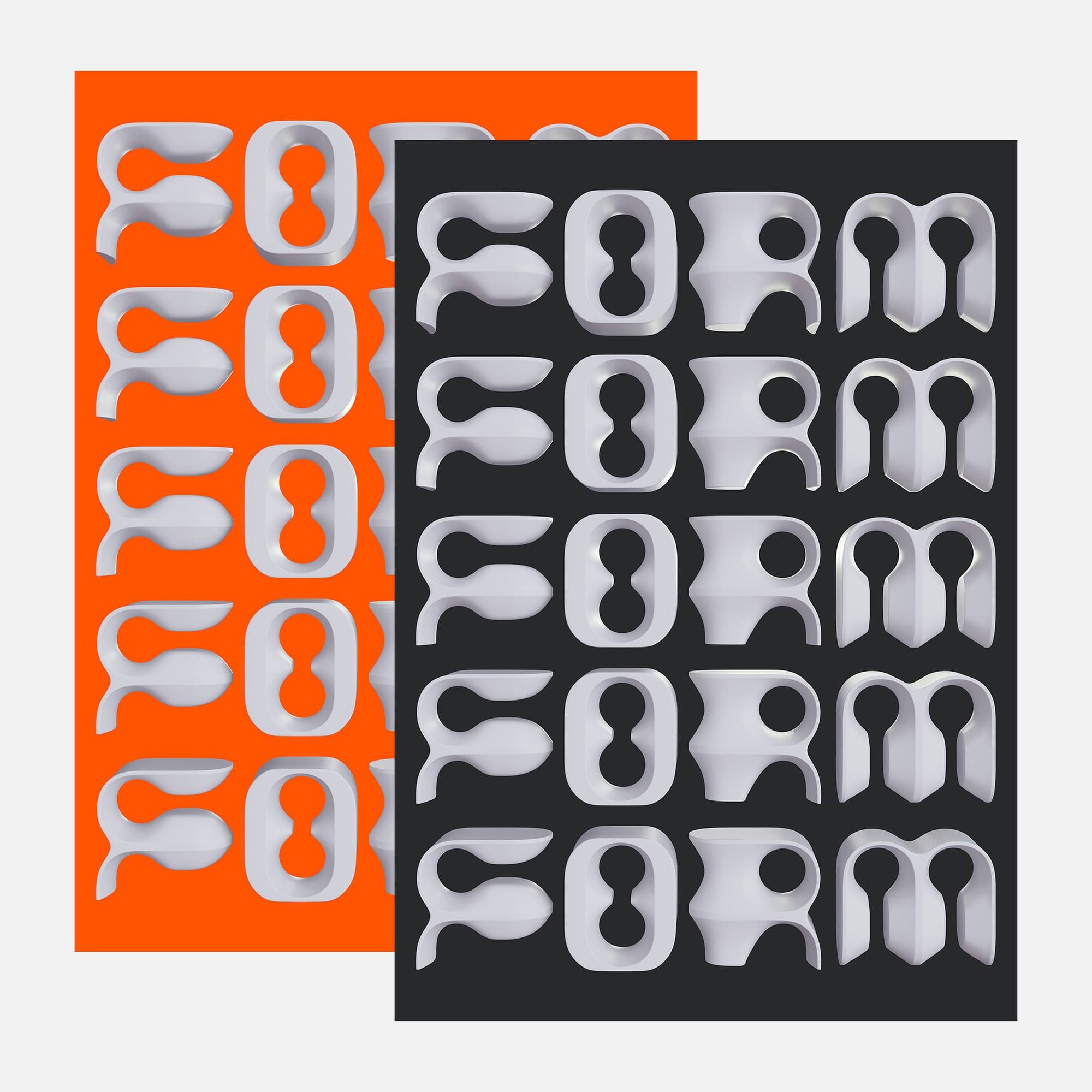
Form
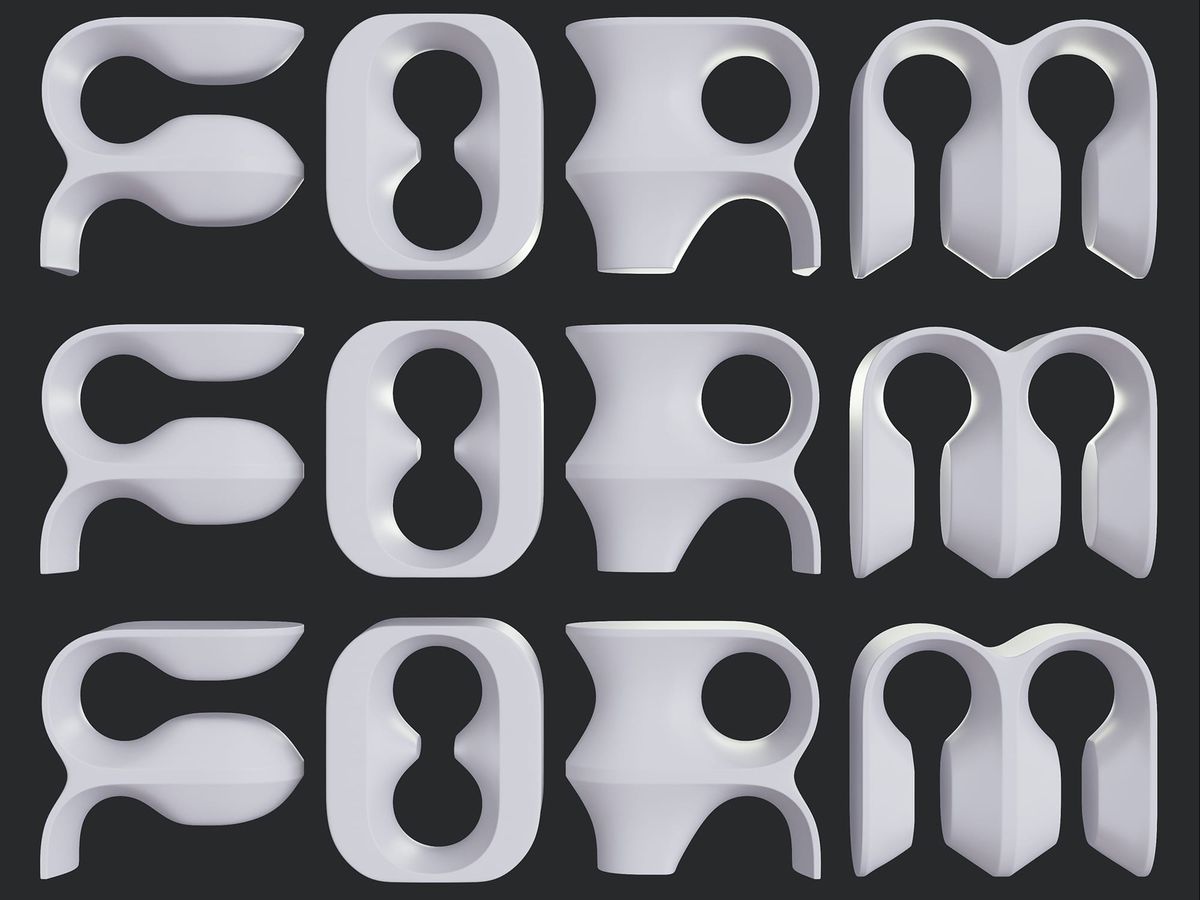
The word carries its own meaning. Five rows of the same letterforms, stacked and repeated 〰 form as content, form as method.
Why this week's poster
Repetition as a structural device. A single word, stacked five times 〰 identical in shape, subtly shifted by light and shadow as the eye moves down the composition.
The build
- Objects. No external objects. The letterforms are the objects 〰 hollow,
thick-walled, architectural. - Letters. Custom 3D glyphs with rounded interior voids and softened
outer edges. Legibility held across all five rows without spacing adjustment. - Colour. Near-white throughout. The charcoal ground does all the
separating work. - Lighting. Single dominant source from upper left. Soft falloff into the
lower rows creates the impression of depth without altering the forms. - Texture. Matte ceramic. No specular highlight. The surface absorbs light
rather than bouncing it. - Type. The letterforms are the type. No supporting text. No secondary
hierarchy.
What worked
- Stacking identical rows produces rhythm without introducing new elements.
- The matte surface keeps the eye on form rather than finish.
- Charcoal ground reads as space, not background 〰 the letters sit in it
rather than on top of it.
What I'd push next time
- A subtle scale reduction per row to imply perspective depth.
- A second lighting pass to lift the bottom row out of near-silhouette.
- A cropped variant 〰 a single row filling the frame.
Print details
- Edition: open
- Sizes: A3
Close
The word describes what it is. Five rows of the same decision, repeated until
the composition held. That's most of the work.