Attract · Force Drawn By
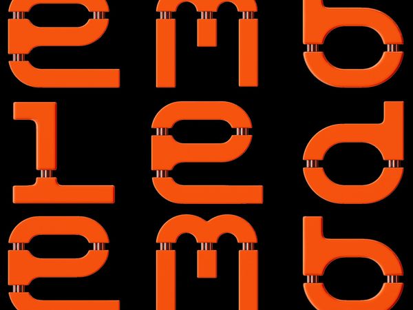
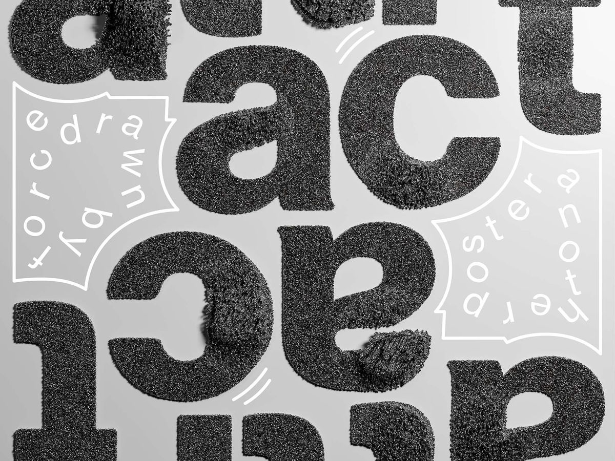
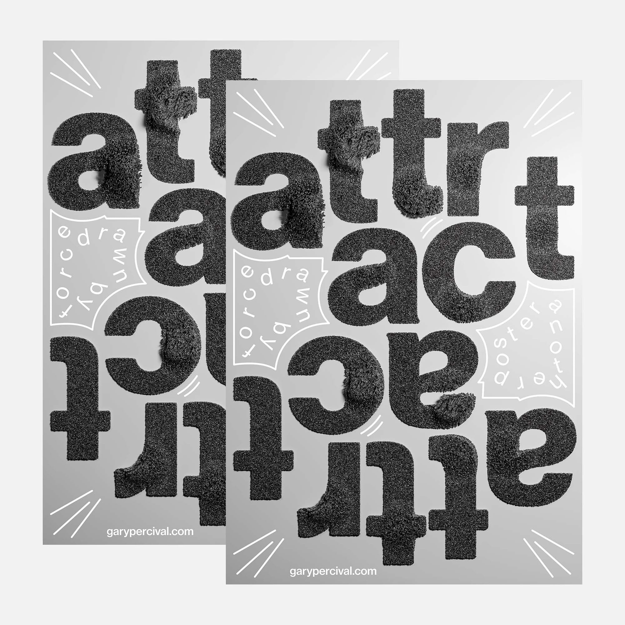
A poster built from dense, textured letterforms with a magnetic pull. Bold shapes drawn together, some flipped, some rotated, all held in one field. A study in gravity, weight, and the quiet force of good type.
Why this week's poster
I wanted weight.
Letters with mass.
Letters with pull.
The word chose itself once the first form landed.
Attract.
Not the soft version.
The physical one.
Iron filings around a magnet.
Grit pulled into shape.
The phrase followed: force drawn by.
Good work pulls people in.
So should the type.
The build
- Objects. Dense particle scatter across extruded letterforms. Millions of tiny fragments held to the surface.
- Letters. Chunky sans forms, wide and stable. Some flipped and rotated to break the reading line and pull the eye across the page.
- Colour. Deep charcoal against a soft silver ground. No hue. Weight does the talking.
- Lighting. Overhead soft key; low fill; a faint bounce to lift the shadows. Every letter sits on the page like an object, not a graphic.
- Texture. Coarse grain across the faces. Micro-fibre halos on the edges where the particles pile up.
- Composition. A tight grid. Letters cropped and inverted so the word reveals itself slowly. White line marks in the corners as visual sparks.
What worked
- The texture reads as force. You feel the pull before you read the word.
- The flipped letters slow the eye down. The read becomes an act.
- Silver ground keeps the weight honest. No colour, no rescue.
What I'd push next time
- A denser particle count on the deepest shadows for more depth.
- A subtle directional drift in the scatter to imply the pull.
- Try one letter breaking the grid, spilling out of frame.
Print details
- Edition: open weekly release
- Sizes: A3
Close
Good work pulls.
Build something with weight.
The right people will feel it.
🎨 See more typographic experiments: Another Poster → / Instagram →