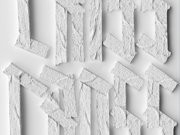
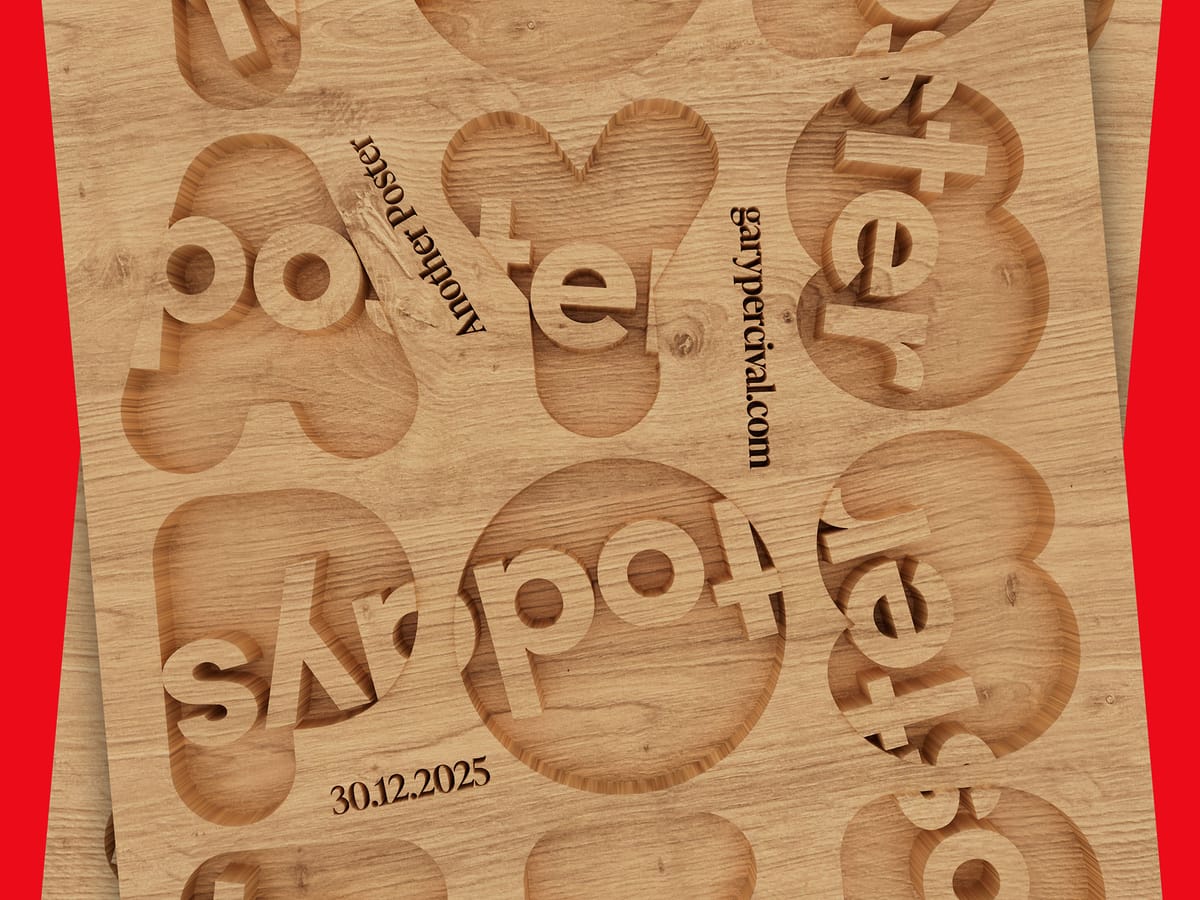
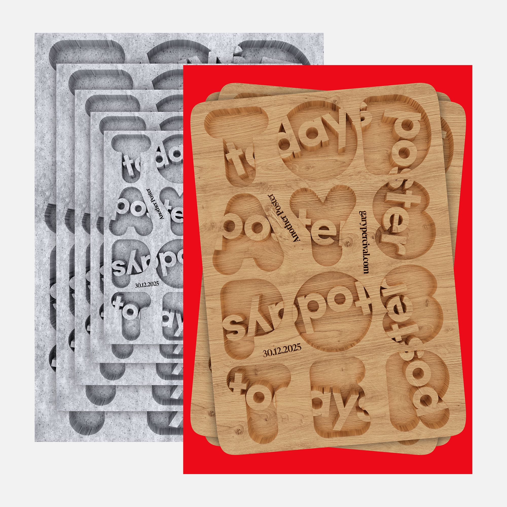
Today’s Poster ·· Routed Type in Wood + Concrete
One layout. Three surfaces. Oak, walnut, and concrete. Same shapes, different weight. Material changes the voice.
Why this week’s poster
I wanted to work with material instead of type style or colour.
So I cut the same layout into oak, walnut, and concrete.
Same forms.
Different attitude.
Wood feels warm.
Concrete feels cold.
Walnut sits between the two with a slower, heavier tone.
The design doesn’t change •• only the surface does.
That was the whole point.
The build
- Base layout. A fixed letter grid routed as one piece.
- Carve depth. Consistent cuts, rounded shoulders for natural tool behaviour.
- Materials.
- Oak for light + openness.
- Walnut for richness + contrast.
- Concrete for blunt, weighty presence.
- Lighting. Soft top light for grain definition · thin rim to lift the edges.
- Type. No decoration; the shadows do the work.
What worked
- The forms stay readable across all three.
- Material alone changes mood more than colour would.
- Concrete version feels new for this series •• almost architectural.
What I’d push next time
- A deeper cut pass on the concrete plate.
- Grain scale variation on the wood versions.
- A motion test to compare material feel in sequence.
Print details
- Edition: Open weekly release
- Sizes: A3
Close
The layout stays the same.
The voice shifts with the surface.
Sometimes you don’t need new ideas •• you test old ones in a new material.
🛍️ Like this style? Explore Posters → / Follow on Instagram →