Offset · One Form, Shifted
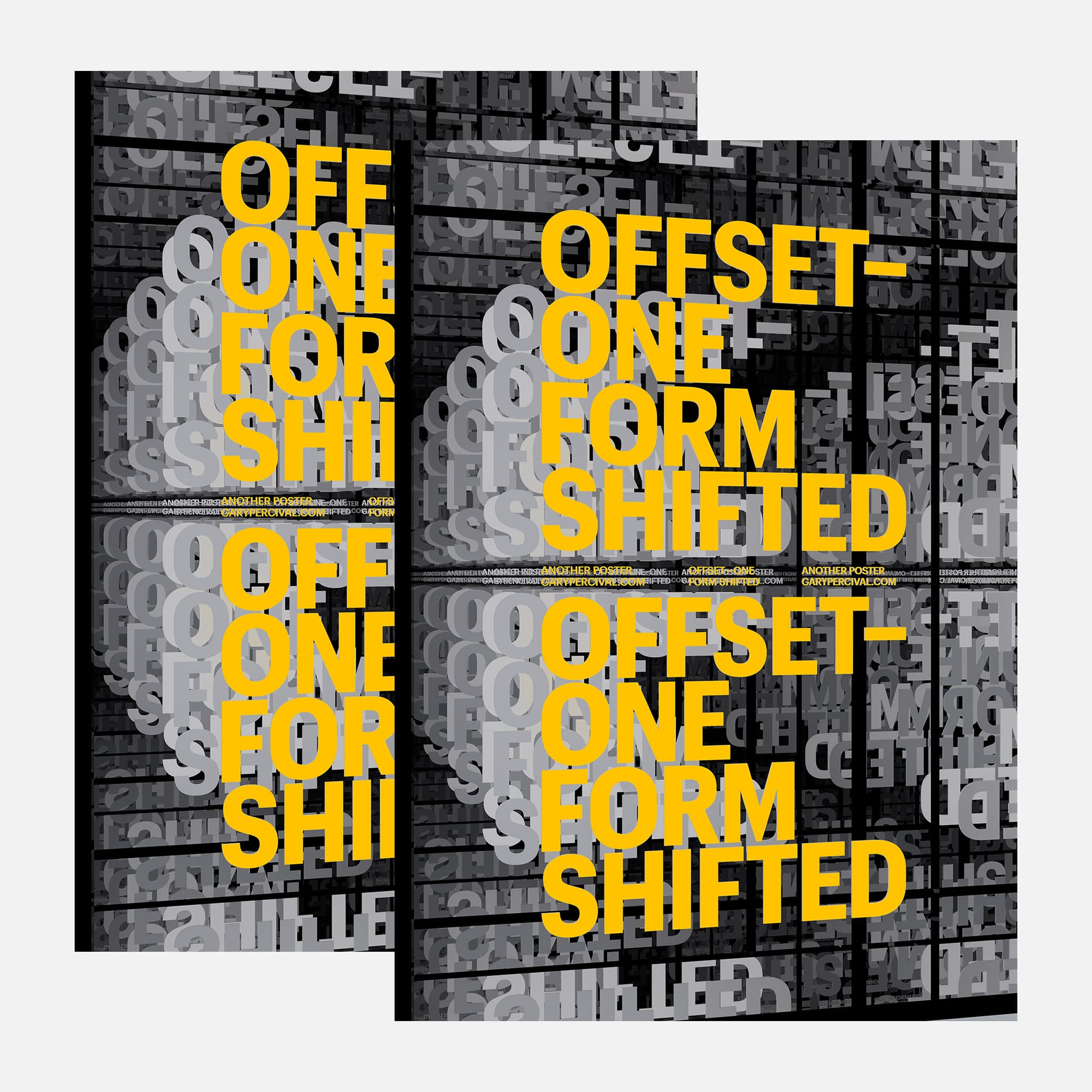
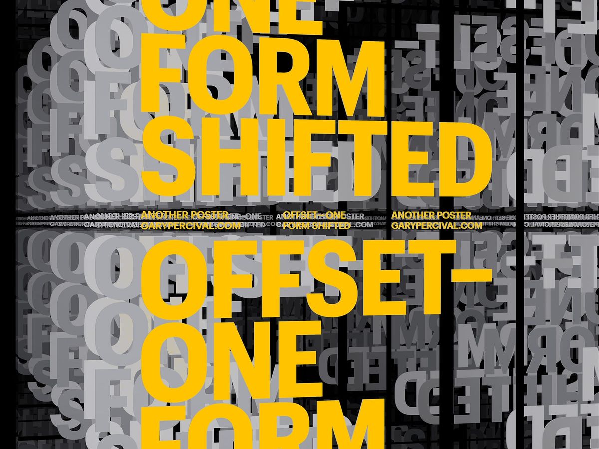
A poster built from a grid of repeated grey letterforms and one yellow headline, run twice at different scales. Offset printing turned into the subject itself.
Why this week's poster
This week I built a field instead of a single letterform.
A grid of grey, extruded slab letters fills the page, cropped hard at black tile borders like a signage wall or a type foundry archive.
Two versions of the same yellow headline sit inside that field, set at different scales.
Offset 〰 One Form Shifted, doubled, became both the title and the structure.
The build
- Objects. A randomised alphabet, duplicated across a black-gridded tile layout.
- Letters. Extruded grey slab serifs, cropped hard at each tile edge for density.
- Colour. Flat yellow headline against a cool grey field; black gridlines carry the contrast.
- Lighting. Even, flat light across the grey field; the yellow type left unlit to read as print, not object.
- Texture. Slight bevel on each extruded letter; matte finish throughout, no gloss.
- Type. Headline repeated twice at different scales; brand microtext tiled through the gaps.
What worked
- The grid holds density without tipping into noise.
- Two scales of the same headline give the page a top and a bottom.
- Flat yellow against modelled grey keeps the read fast.
What I'd push next time
- Tighter registration on the tile grid at the seams.
- A version with the grey field in motion, tiles shifting independently.
- More contrast between the two headline scales.
Print details
- Edition: open
- Sizes: A3
Close
Offset started as a printing term.
Here it's a grid, a repeat, a shift in scale.
The letterforms stay grey.
The headline stays yellow.
Everything else is structure.