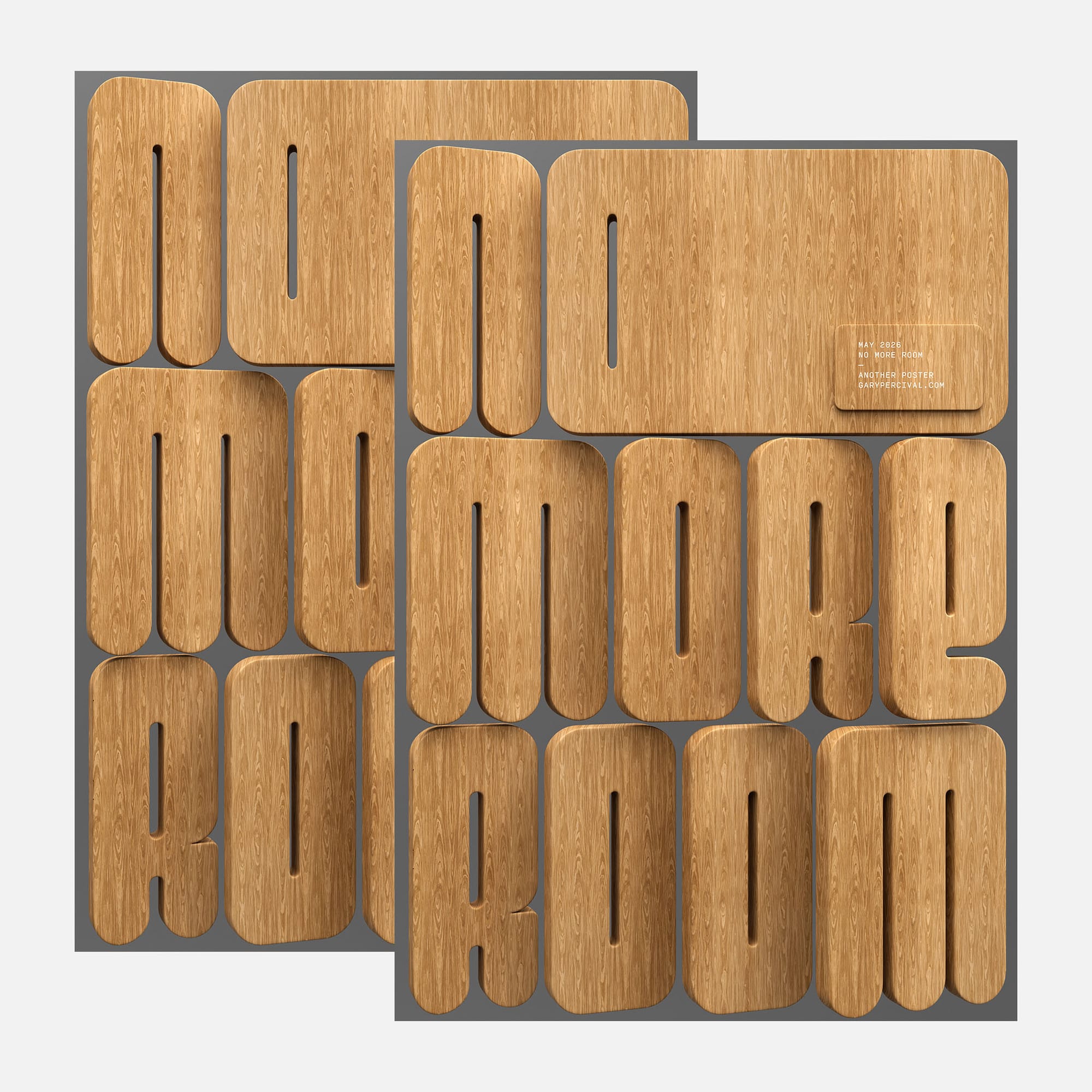
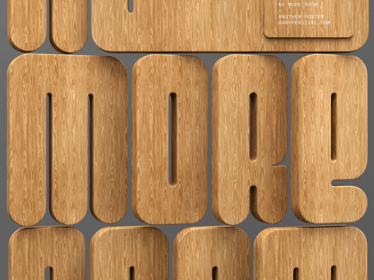
No More Room
Oversized oak letters. No gap between them. A poster built on pressure 〰 when the frame is full, the type has to carry everything.
Why this week's poster
The idea was compression. Letters so large they have nowhere to go. Each character butts against the frame edge; the counters are the only breathing room left.
Wood felt right for that. A material with mass and warmth. Something that reads as physical rather than rendered.
The build
- Objects. Each letter modelled as a thick slab with rounded edges. The depth reads as furniture-scale 〰 solid, not decorative.
- Letters. Set three lines: NO · MORE · ROOM. Scaled until the letterforms break the frame on both sides. Intentional overflow.
- Color. Natural oak grain throughout. Warm amber mid-tones with darker streaks in the wood. Grey ground to keep focus on the material.
- Lighting. Top-down soft key · gentle fill from below · subtle shadow depth between letters to separate the forms.
- Texture. Straight-grain oak mapped across every face. The grain direction stays consistent across the word to read as one plank, not individual pieces.
- Type. Small label block set in monospaced caps, bottom-right. Date, title, series name, URL. Sits on its own rounded card in the same oak material.
What worked
- The grain scale relative to letter size 〰 large enough to read clearly, not so large it fragments.
- Overflow at the frame edges makes the letters feel heavier than the canvas.
- The rounded corners soften what could have been a brutal composition.
What I'd push next time
- More variation in grain direction between letters 〰 each character as a separate cut of wood.
- A tighter shadow pass on the counters; the interior negative space could hold more depth.
- A dark-ground variant to see how the oak reads against near-black.
Print details
- Edition: open
- Sizes: A3
Close
The frame ran out of space. That was the brief. When compression is the constraint, scale becomes the only tool.