Flicking Through the Pages · Movement Builds Meaning
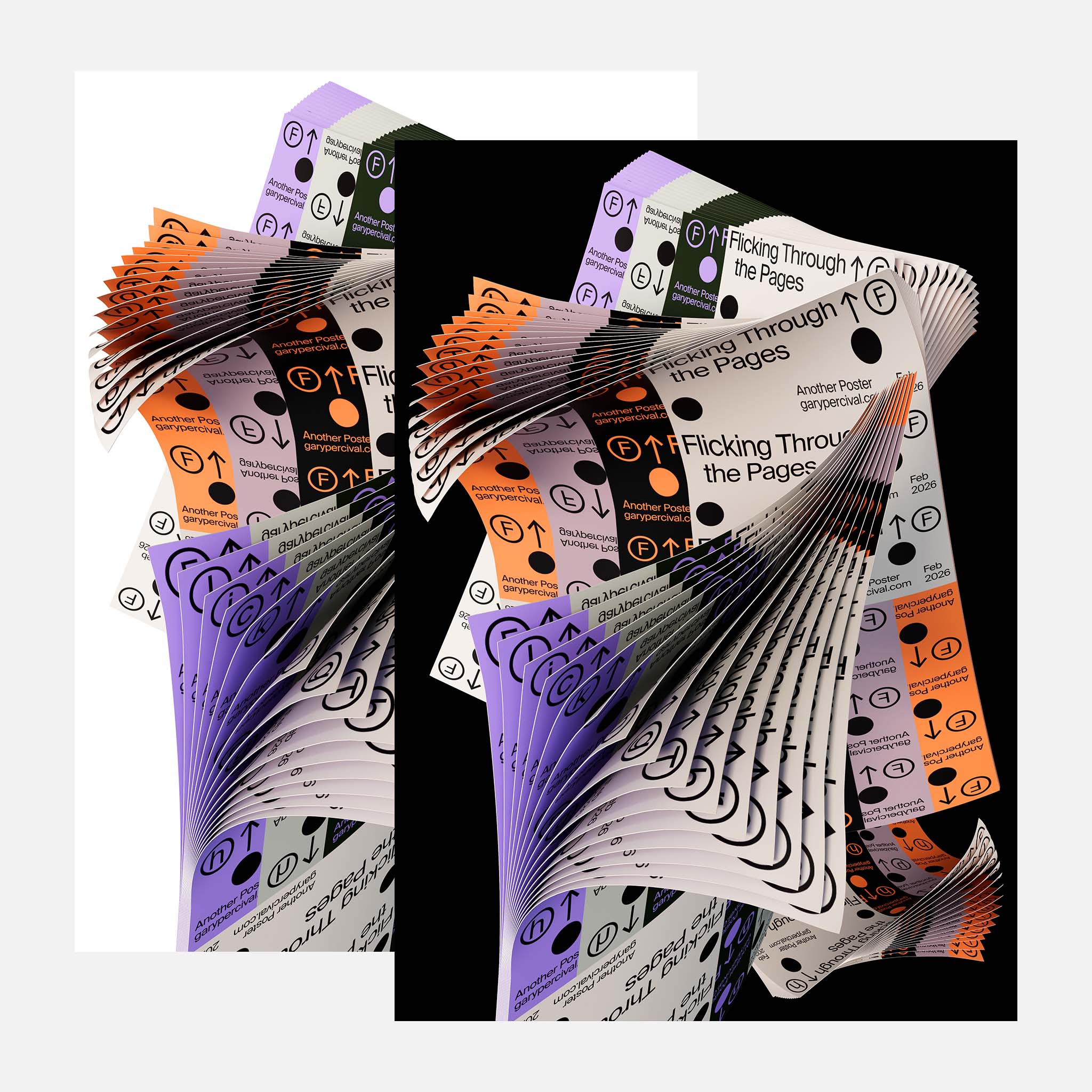
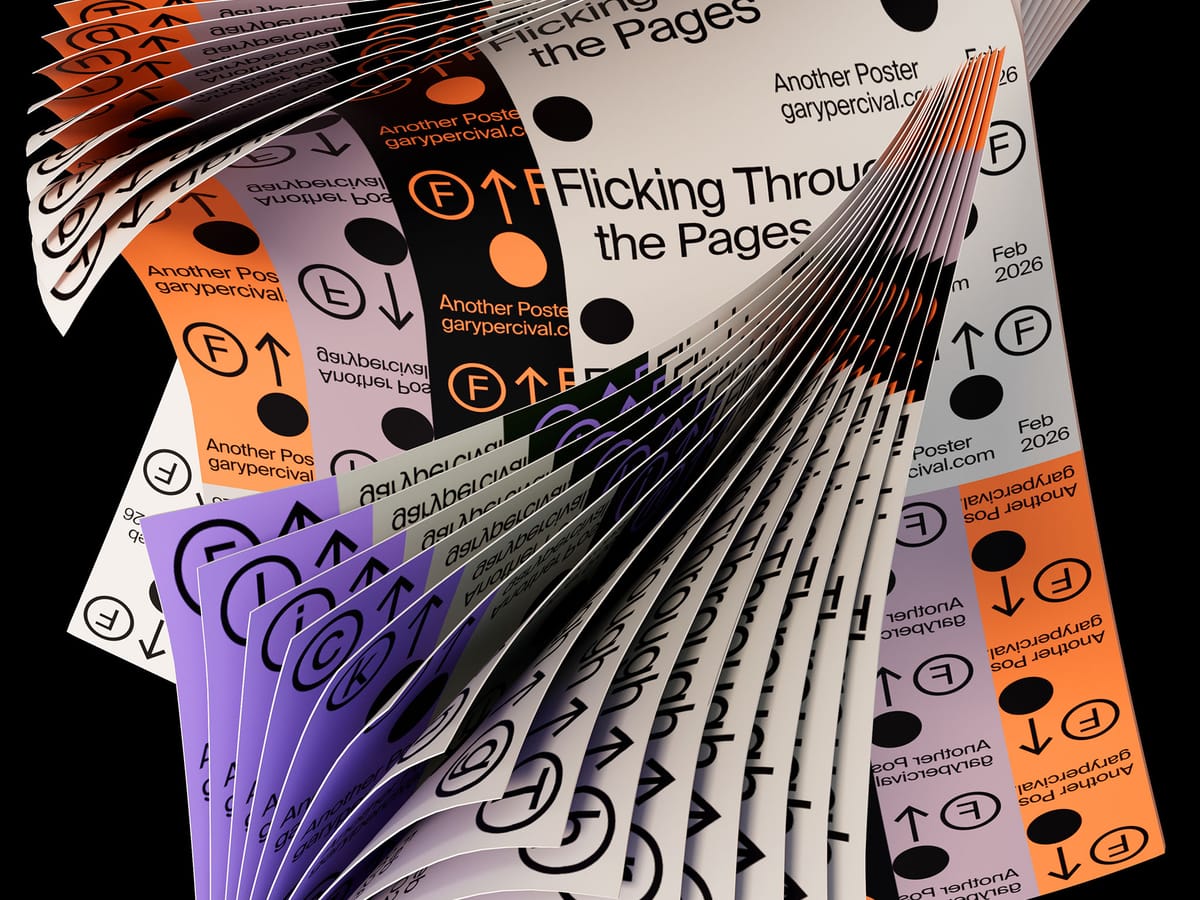
A poster built from stacked sheets. Repeated. Offset. Curved into motion. A study in rhythm, sequence, and how small changes create flow.
Why this week’s poster
I kept thinking about pace.
Not speed.
Progress.
The kind you feel when flipping through a book.
One page. Then another. Then another.
Nothing dramatic happens.
Until it does.
A stack becomes a story.
So I built a poster from repetition.
Same sheet. Slight shifts. Let motion do the talking.
The phrase landed quickly:
Flicking Through the Pages.
Forward. Continuous. No announcement.
The build
- Base form. One clean poster layout. Strong type. High contrast. Designed flat first.
- System. Duplicated dozens of times. Offset rotation and position by tiny increments.
- Structure. Bent into a loose spiral. Enough curve to suggest motion without chaos.
- Colourways. Cream, orange, violet, green. Alternating blocks create rhythm like chapters.
- Lighting. Soft key 〰️ broad fill 〰️ light rim to separate edges.
- Material. Slight paper thickness and micro-shadow between sheets. Helps the stack feel real.
What worked
- Repetition carries the idea without extra effects.
- The edges create natural stripes and patterns.
- Type stays readable even inside motion.
- The stack reads instantly at small sizes.
What I’d push next time
- Slight variation in curl tension for less uniform bends.
- A closer crop version focused only on edges.
- A short loop where the stack flips continuously.
Print details
- Edition: open weekly release
- Sizes: A3
Close
Progress rarely looks dramatic.
It looks like one page after another.
Stack enough of them and you have a body of work.
Keep flipping.
