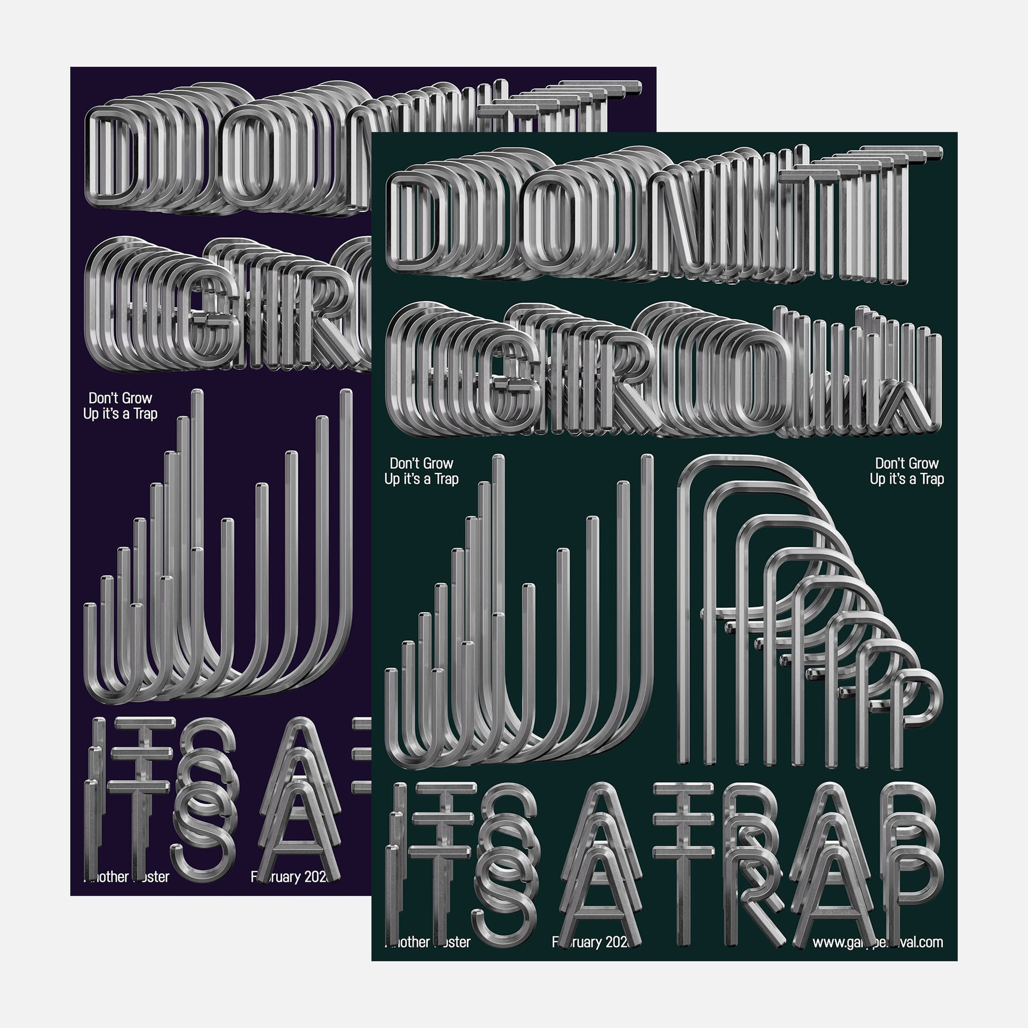
Don’t Grow Up · It’s a Trap
Tubular forms repeat through depth to build a bold phrase about staying playful. A study in structure, compression, and perspective. A reminder to keep curiosity alive.
Why this week’s poster
I kept thinking about seriousness.
How it creeps in.
How play disappears.
How experimentation starts to feel risky.
Growth should add freedom. Not remove it.
The phrase landed fast: Don’t grow up. It’s a trap.
Not anti-maturity.
Anti-rigidity.
Stay curious. Stay flexible. Stay willing to try things badly.
The build
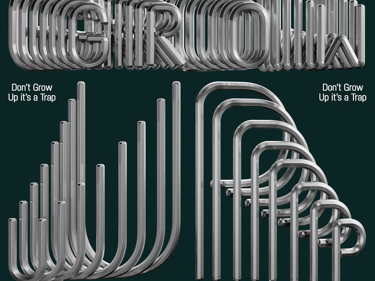
- Structure. One tubular letterform system. Rounded corners. Consistent radius. Built once 〰️ repeated many times.
- Depth. Copies pushed back through Z-space. Slight offsets to create motion and density.
- Compression. Overlap increases toward the centre. Tension builds without losing legibility.
- Material. Brushed chrome with micro variation. Enough imperfection to catch highlights.
- Lighting. Large soft key 〰️ controlled reflections 〰️ darker environment to hold contrast.
- Colour. Deep green field. Calm base against reflective metal.
- Type layout. Supporting captions kept minimal. Artwork leads.
What worked
- Repetition creates rhythm fast.
- Tubes feel playful without losing strength.
- Depth adds movement without chaos.
- Chrome reflections give scale.
What I’d push next time
- More variation in tube wear.
- Slight perspective exaggeration for drama.
- Animation test: letters flowing forward through space.
Print details
- Edition: open weekly release
- Sizes: A3
Close
Staying playful keeps you adaptable.
Adaptability keeps you relevant.
This poster records that attitude.