Divide · Twisted Into Letterforms
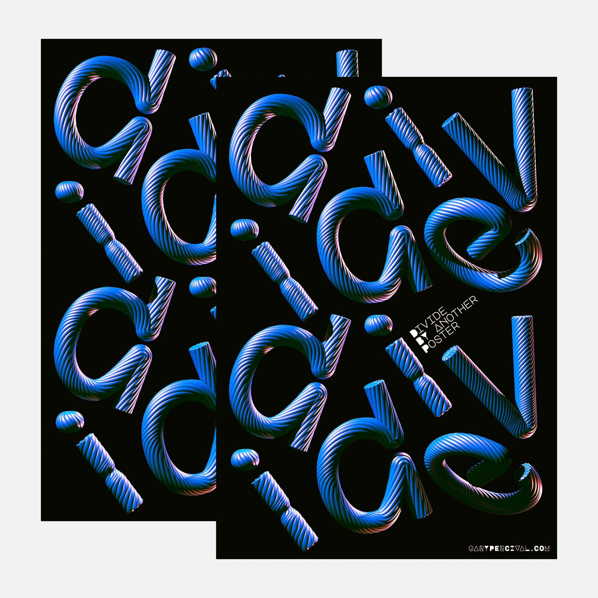
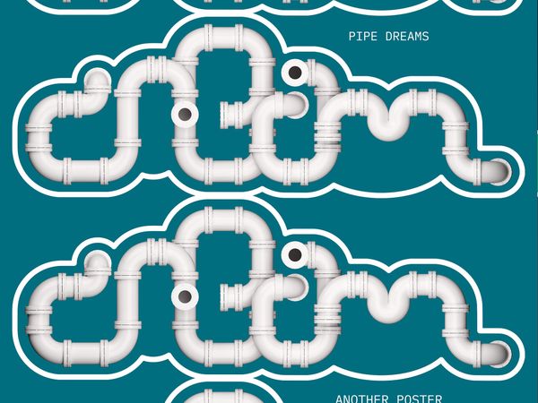
A typographic poster built from twisted, ribbed strands. Each letter bends, splits and separates, pushing the boundary between typography and abstraction.

Why this week's poster
I wanted to explore what happens when letterforms begin to lose their familiar structure.
The starting point was a series of twisted, ribbed forms.
Rather than constructing conventional letters and applying a texture,
I wanted the material itself to determine their shape.
The word Divide gave me something to work against.
Each letter could bend, separate and move independently,
while still belonging to the same word.
The challenge was retaining enough of each letterform's character to make it recognisable without losing the freedom to distort it.
The build
- Forms. Continuous, ribbed strands twisted and bent into individual letterforms.
- Letters. Each character was constructed as a dimensional object, with curves, folds and open ends influencing its shape.
- Composition. The word is broken into separate elements and repeated twice down the page, creating a loose rhythm.
- Colour. Electric blue forms with pink and violet highlights against a flat black background.
- Lighting. Directional highlights bring out the ridges, while darker areas emphasise the depth of each twist.
- Texture. Repeated grooves follow the contours of the letterforms, exaggerating their movement and volume.
- Type. Small white supporting typography sits diagonally between the two arrangements, contrasting with the irregular forms.
What worked
- The ribbed surfaces catch the light differently as the forms change direction, giving the letters a strong sense of volume.
- The contrast between blue, pink and black creates depth without requiring additional graphic elements.
- Separating the letters gives each form room to exist as an individual object.
- Repeating the arrangement establishes a visual rhythm while allowing the composition to remain deliberately irregular.
What I'd push next time
- Explore how far the letterforms could be distorted before becoming completely abstract.
- Experiment with variations in the width and spacing of the ribs.
- Test a more restrained lighting arrangement to see whether the forms retain their character without the strong colour contrast.
Closing
There's a point where a letter stops behaving like typography and starts becoming an abstract shape.
That's what interested me about Divide.
The individual forms don't need to be immediately readable to have a typographic identity. Their curves, proportions and construction still carry something of the letters they came from.
For this poster, finding that balance was the experiment.