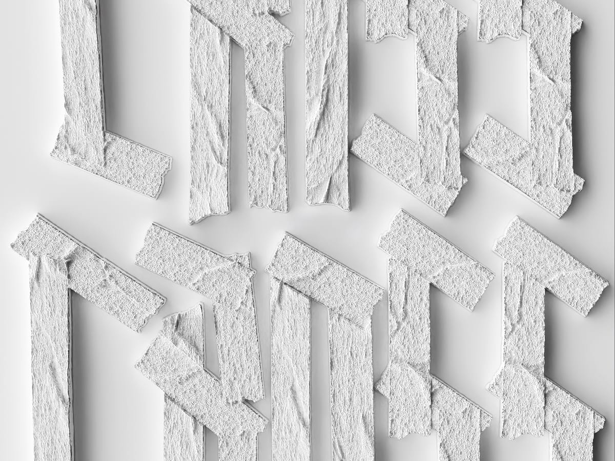
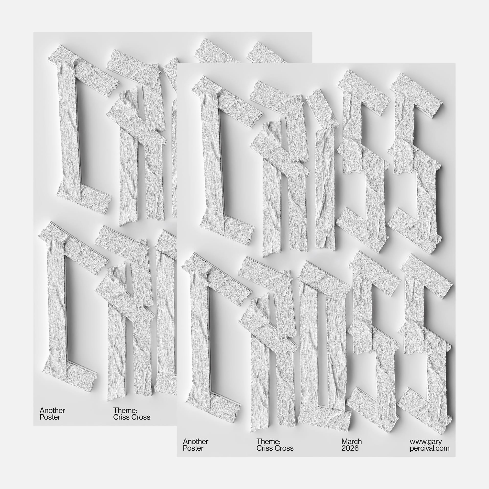
Criss Cross · Structure Through Intersections
Letterforms built from intersecting strips. Repeated, offset, and layered until structure emerges from simple crossings.
Why this week’s poster
I wanted to explore structure through repetition.
One strip is nothing.
Two create a crossing.
Repeat that crossing and a system appears.
The idea came from intersection.
Simple elements meeting, overlapping, reinforcing.
The phrase followed: Criss Cross.
Not decoration.
Construction.
The letters are not drawn.
They are assembled.
The build
• Elements. Narrow strips with a rough plaster-like surface. Slight variation to avoid uniformity.
• Letters. Built from repeated verticals and angled crossbars. Intersections define the form.
• System. Same logic applied across every letter. Consistency creates cohesion.
• Texture. Subtle surface irregularities to catch light and break flatness.
• Lighting. Soft top-down key 〰️ minimal fill 〰️ controlled shadows to emphasise overlap.
• Composition. Grid-based layout. Repetition carries the image.
What worked
• Intersections create depth without adding complexity.
• Repetition builds rhythm across the page.
• Texture gives presence without relying on colour.
What I’d push next time
• Push variation in strip width slightly further.
• Explore a darker background for contrast.
• Test breaking the grid to introduce tension.
Notes for fellow designers
• Build from one rule and repeat it. Systems scale better than ideas.
• Intersections create hierarchy without extra elements.
• Texture should support form, not compete with it.
Print details
- Edition: open weekly release
- Sizes: A3
Close
Structure does not need complexity.
Repeat a simple idea long enough and it becomes something solid.
🛍️ Like this style? Explore Posters → / Follow on Instagram →