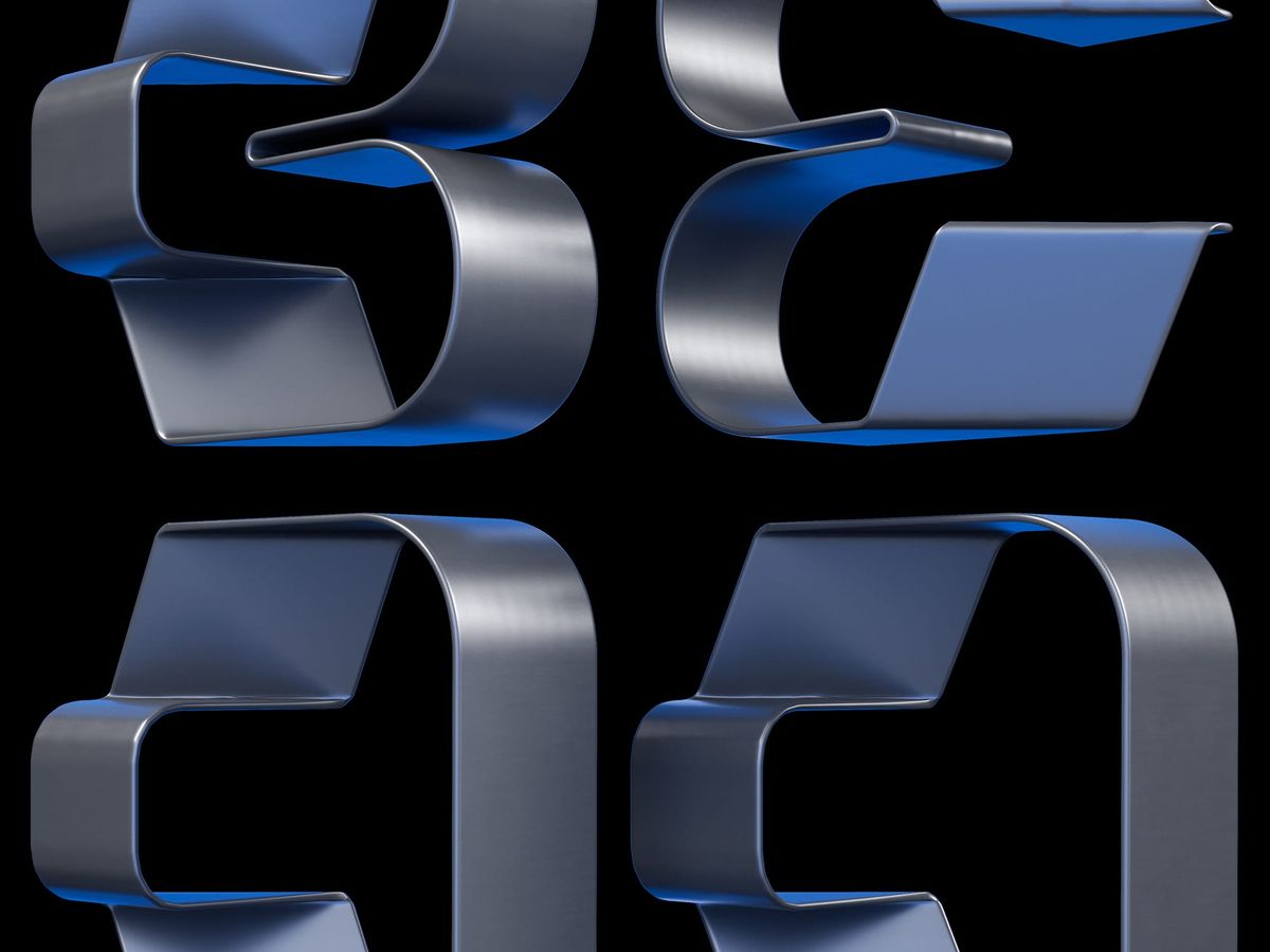
Blend · Structure Through Flow
A typographic study built from a single continuous metal strip. Bent, folded, and held under tension. Form emerges from one surface.
Why this week’s poster
I wanted continuity.
One element doing all the work.
No cuts.
No joins.
One strip that turns, holds, and resolves.
The word followed: Blend.
Not as softness.
As integration.
Parts losing separation as they become one system.
The build
- Element. Single metal strip. Consistent thickness. Controlled width.
- Form. Bends define the letters. Direction changes carry meaning.
- System. Same rules applied across each form. No exceptions.
- Material. Brushed metal outside 〰️ saturated blue interior to separate planes.
- Lighting. Soft key for volume 〰️ minimal fill 〰️ blue bounce held inside the folds.
- Edges. Tight radii. Clean transitions. No visual noise.
- Composition. Isolated on black. Spacing does the work.
What worked
- One strip keeps the idea clear.
- Interior colour creates depth without adding parts.
- The bends read fast at distance.
What I’d push next time
- Introduce slight compression through tighter bends to increase tension.
- Refine edge highlights to avoid long flat runs.
- Test stricter alignment of inflection points to sharpen structure.
Notes
- One constraint raises clarity. Add more and the idea weakens.
- Direction changes carry hierarchy. Place them with intent.
- Separate planes with light before adding geometry.
Print details
- Edition: open weekly release
- Sizes: A3
Close
Keep the system tight.
Let the structure carry the idea.